Global Influences Shaping Luxury Interior Design in India
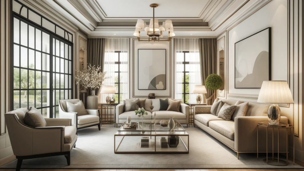
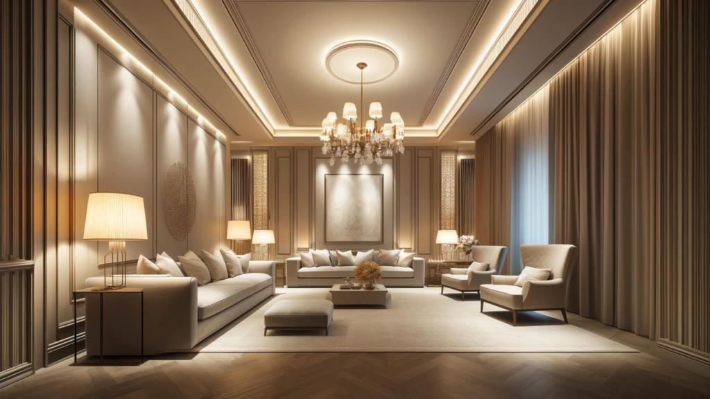
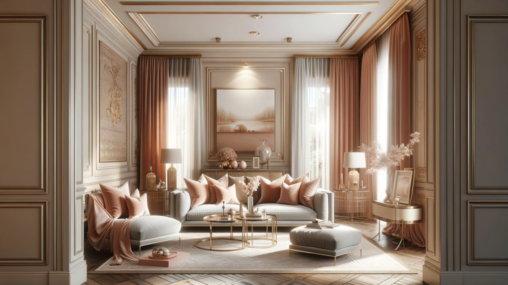
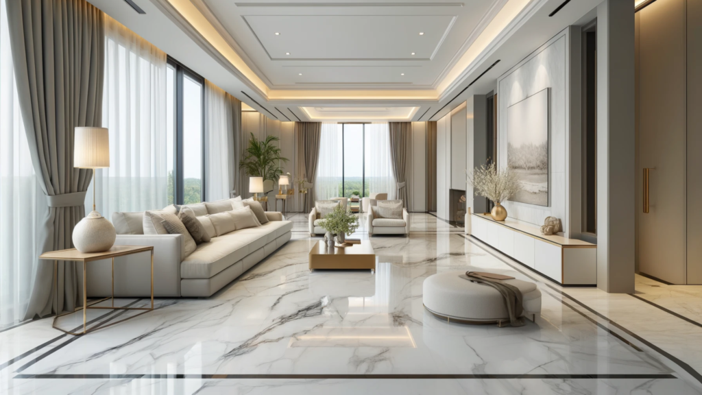
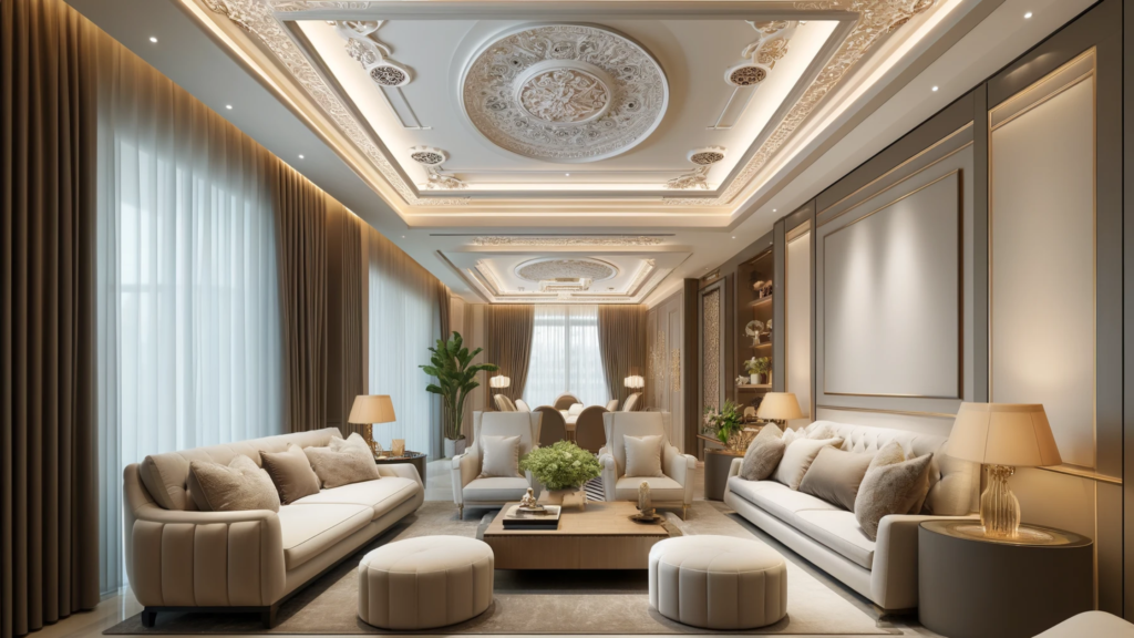
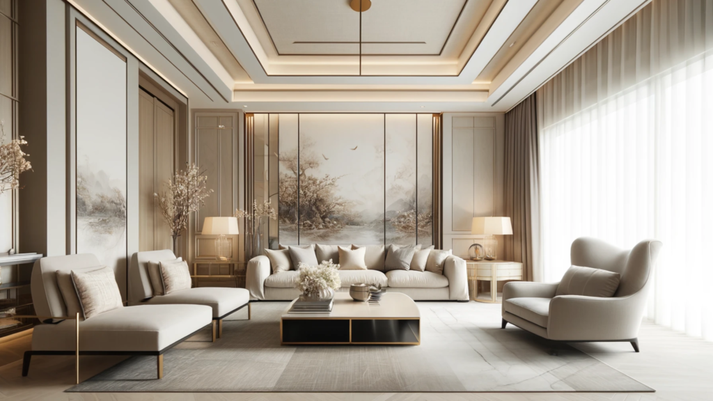
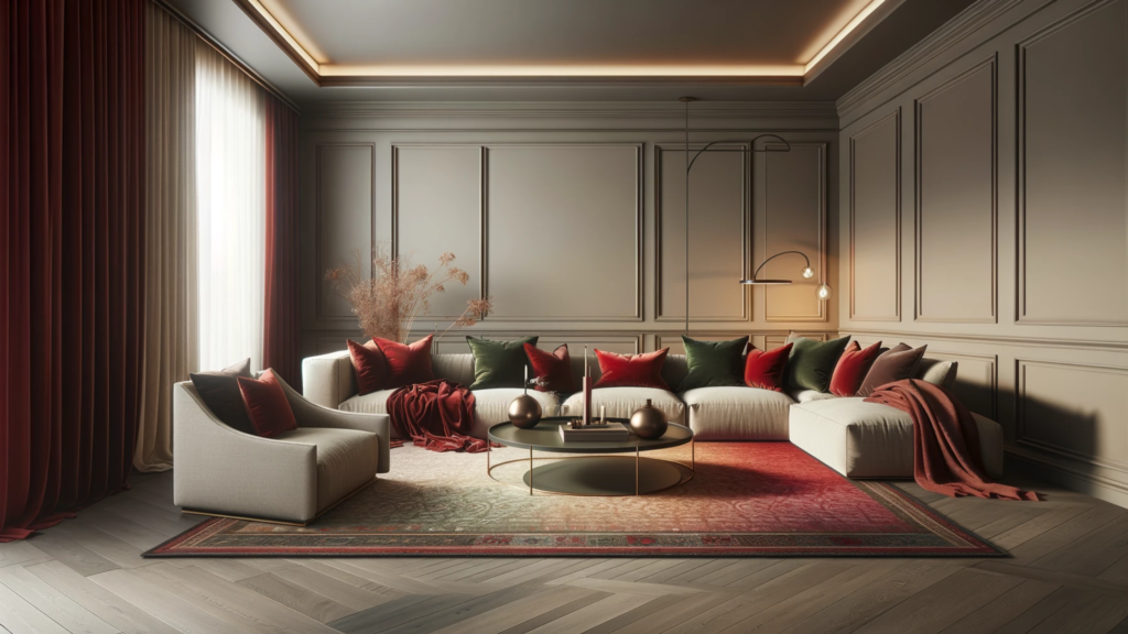
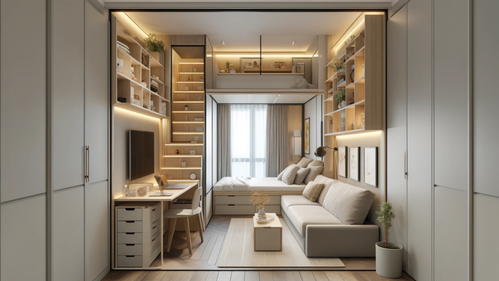
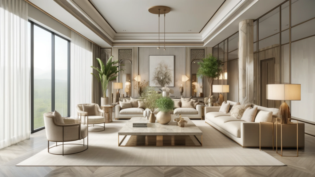
Global Influences Shaping Luxury Interior Design in India Interior design is an art form that has evolved such that it is indicative of the culture, belief systems and practices that people in a certain region follow. With the era of globalisation, cultures have intermixed to form a diverse array of interior design, especially luxury interior design, which is one of the most popular interior design trends of 2025. Table of Contents Luxury in Indian Interior Design Cultural Significance Historical Roots: Indian luxury interiors draw inspiration from historical periods such as the Mughal era, the Rajput palaces, and colonial influences, integrating elements like detailed carvings, frescoes, and luxurious textiles. Craftsmanship: India is renowned for its artisanal skills in weaving, embroidery, woodworking, and stone carving. Luxury interiors often showcase these handcrafted elements, reflecting the country’s rich artisanal heritage. Modern Trends in Luxury Interior Design Contemporary Fusion: Modern luxury interiors in India incorporate global trends while preserving traditional aesthetics. This fusion creates a distinctive style that is both globally relevant and deeply rooted in Indian culture. Personalization: Growing emphasis on personalised spaces that reflect individual tastes and preferences. Custom-made furniture, unique decor pieces, and bespoke designs are increasingly popular in Indian luxury interiors. Importance of Global Interior Design Influences Broadening Horizons Exposure to Global Trends: The rise of globalisation and digital media has exposed Indian designers and homeowners to international design trends, broadening their horizons and influencing their design preferences. Diverse Inspirations: Global influences bring a diverse range of styles, materials, and design philosophies, allowing for a richer and more varied interior design landscape in India. Fusion of Styles Eclectic Mix: Global influences facilitate the fusion of different styles, creating eclectic interiors that blend the best of multiple design traditions. This results in unique and innovative design solutions. Cultural Exchange: The exchange of design ideas and techniques between India and other countries promotes a cross-cultural aesthetic, enriching the overall design narrative. Introduction of New Materials and Technologies Innovative Materials: Global influences introduce new and innovative materials, such as sustainable alternatives, high-performance composites, and luxury finishes, enhancing the quality and appeal of interiors. Advanced Technologies: Adoption of global technological advancements in interior design, such as smart home systems, energy-efficient solutions, and advanced lighting technologies, elevates the functionality and sophistication of luxury interiors. Sustainability and Eco-Friendly Practices Global Awareness: Increased awareness of global sustainability practices encourages the incorporation of eco-friendly materials and designs in Indian luxury interiors. This includes the use of recycled materials, energy-efficient designs, and sustainable sourcing. Green Certifications: Global standards and certifications for green building practices inspire Indian designers to adopt environmentally responsible practices, contributing to sustainable luxury living. Enhancing Aesthetic Appeal through Luxury Interior Design Global Aesthetic Standards: Exposure to global design standards and aesthetics raises the bar for quality and craftsmanship in Indian luxury interiors. This leads to more refined and polished design outcomes. Innovative Design Solutions: Global influences introduce innovative design solutions and creative ideas that push the boundaries of traditional interior design, resulting in more dynamic and visually appealing spaces. Key Global Influences on Indian Luxury Interior Design Western Influence: Modern, Contemporary, and Classic European Styles Western influence on Indian luxury interior design is profound, with modern, contemporary, and classic European styles leaving a significant mark. Modern European design is characterised by clean lines, functional layouts, and an emphasis on minimalism. This style promotes the use of neutral colour palettes, sleek furniture, and open spaces, creating interiors that are both sophisticated and comfortable. Classic European styles like Victorian, Baroque, and Renaissance introduce elements of grandeur and elegance into Indian interiors. These styles are known for their ornate details, luxurious fabrics, and antique furnishings, offering a timeless appeal that resonates with the Indian affinity for opulence and heritage. Asian Influence: Zen Philosophy, Minimalism, and Feng Shui Principles Asian influences, particularly from Japan and China, bring a sense of tranquillity and harmony to Indian luxury interior design. Zen philosophy emphasises simplicity, natural materials, and a connection to nature. This translates into interiors that use wood, bamboo, and stone, along with neutral colours and minimalist decor to create serene and balanced spaces. Japanese minimalism further enhances this aesthetic by focusing on functionality, uncluttered spaces, and the beauty of imperfection, known as wabi-sabi. This approach is increasingly popular in modern Indian homes that seek to reduce visual noise and foster a sense of calm. Feng Shui principles from China influence the spatial arrangement to enhance the flow of energy (qi) and promote well-being. This involves strategic placement of furniture, use of specific colours, and incorporation of elements like water features and plants to create harmonious environments. Scandinavian Influence: Hygge, Simplicity, and Functionality Scandinavian design principles have gained traction in Indian luxury interiors due to their emphasis on simplicity, functionality, and cosiness, encapsulated in the Danish concept of hygge. This style is characterised by a minimalist aesthetic, with a focus on clean lines, neutral tones, and natural materials such as wood and leather. Scandinavian interiors often feature functional furniture that combines form and utility, ensuring that every piece serves a purpose without sacrificing aesthetic appeal. Simplicity is key, with clutter-free spaces that emphasise natural light and open layouts. The use of soft textiles, warm lighting, and cosy elements like rugs and throws creates a welcoming and comfortable atmosphere. This approach aligns well with modern Indian lifestyles, where there is a growing preference for understated elegance and practical luxury. Middle Eastern Influence: Rich Textures, Ornate Patterns, and Luxury Materials Middle Eastern influences bring a sense of exotic opulence and grandeur to Indian luxury interior design. This region is known for its rich textures, including intricate mosaics, plush carpets, and detailed metalwork. Ornate patterns, such as geometric designs, arabesques, and calligraphy, are often used in tiles, textiles, and wall decor, adding depth and visual interest to interiors. Luxury materials like marble, silk, and gold accents are frequently incorporated. Middle Eastern interiors also emphasise the use of vibrant colours, such as deep blues, rich reds, and sparkling golds, which create a warm and inviting atmosphere. By blending Middle Eastern elements with traditional Indian motifs, designers create luxurious